

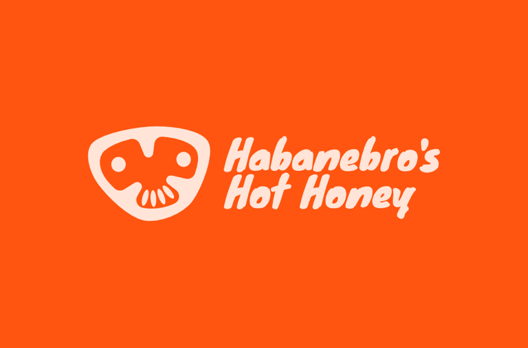
Habanebro's Hot Honey
Habanebro’s started as an experiment. How much heat can you pack into honey before it bites back? As it turns out, quite a lot. They nailed the flavour. Sweet, fiery, and just the right side of reckless.
The problem? They weren’t sure how to present themselves. Every other bottle on the shelf looked like it played it safe. They were stuck with a choice, to conform, or contest. They chose to contest, and brought us in to make it count.
We turned up the personality, dialled into the chaos, and built a brand identity that’s as bold, cheeky, and unmissable as the honey itself.
The problem.
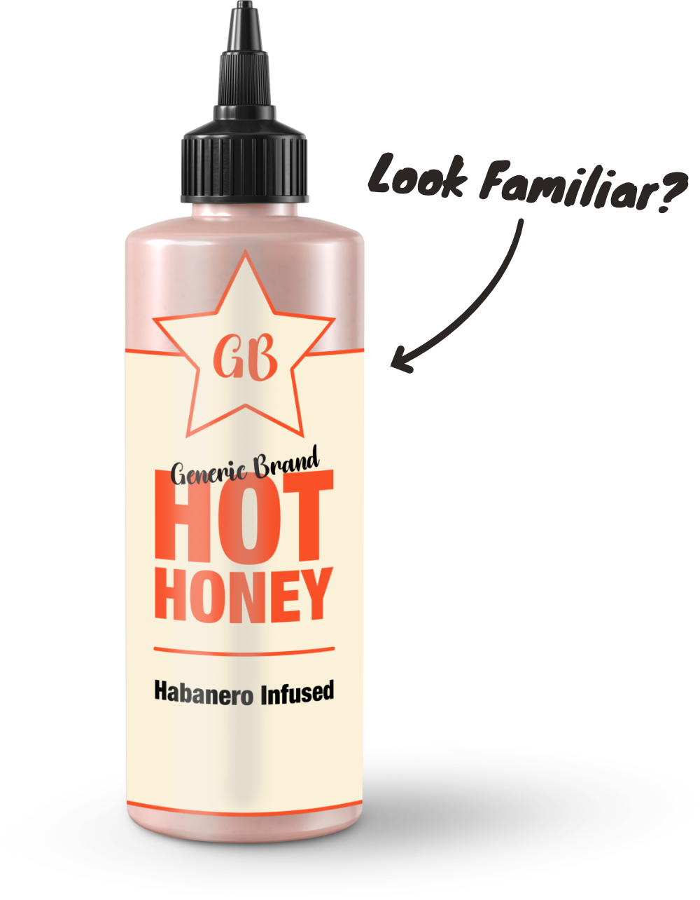
Hot honey was once an under-the-radar condiment, found at craft markets or sold by small-batch producers online. Now, it’s everywhere. A breakout flavour that’s quickly become a staple. The downside? A flood of brands entering the market just as quickly, with many built to follow, not stand apart.
The category became saturated with sameness. Soft “artisan” aesthetics, using thin script fonts, muted palettes, and familiar craft cues, sat alongside predictable visuals of bees, honeycombs, and dripping honey. Others took a more minimalist route, stripping everything back to name and type. Across both ends of the spectrum, everything signalled quality, but very little felt distinctive.
The result was a category full of products that promised bold flavour, but looked safe doing it. If I was happy with the flavour of Dave's hot honey, why would I try Mike's? Especially if they looked the same.
The solution.
They had the recipe. They had the heat. What they didn’t have was a way to make the world take notice.
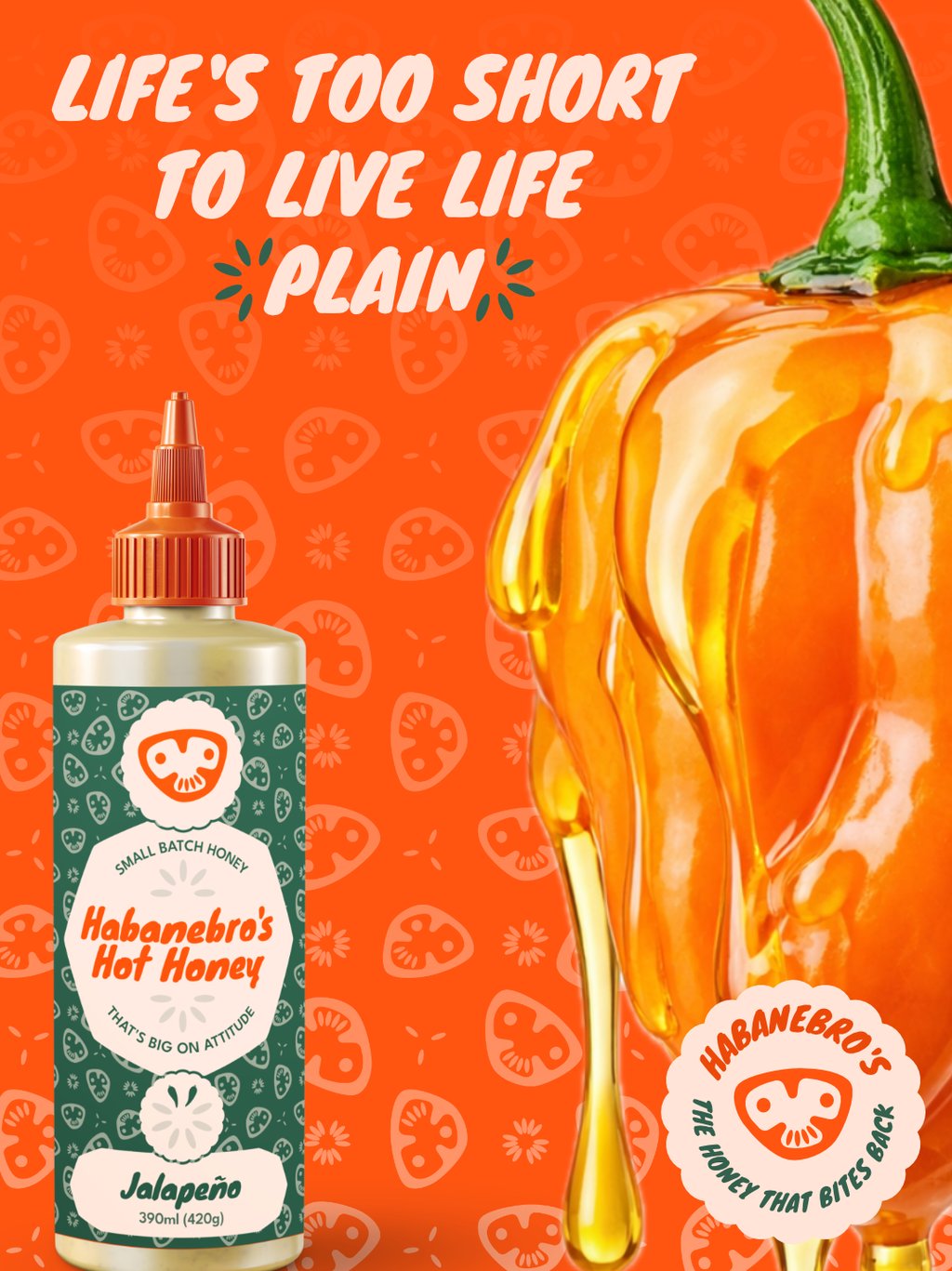
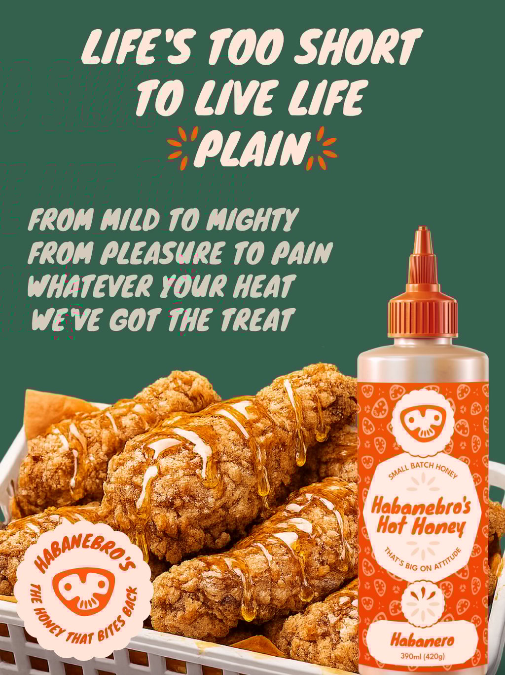
We started by analysing the competitors, identifying where they had played it safe. Then we stripped away the clichés, ignored the trends, and built a brand identity that broke the rules. We knew that bold typography, striking colour choices, and cheeky, confident graphics would give Habanebro’s a personality as fiery and unapologetic as the honey inside.
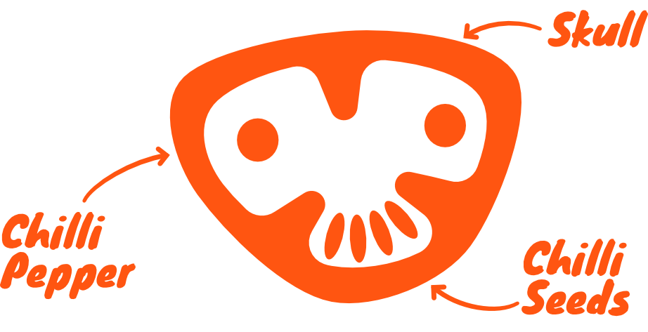
The brandmark.
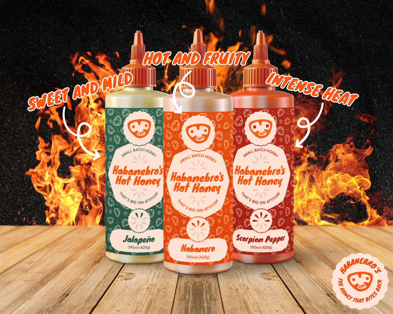
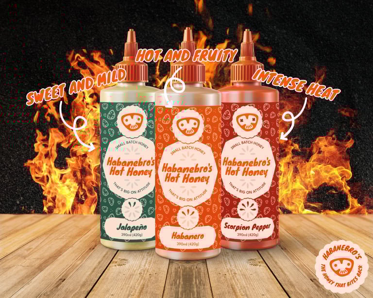
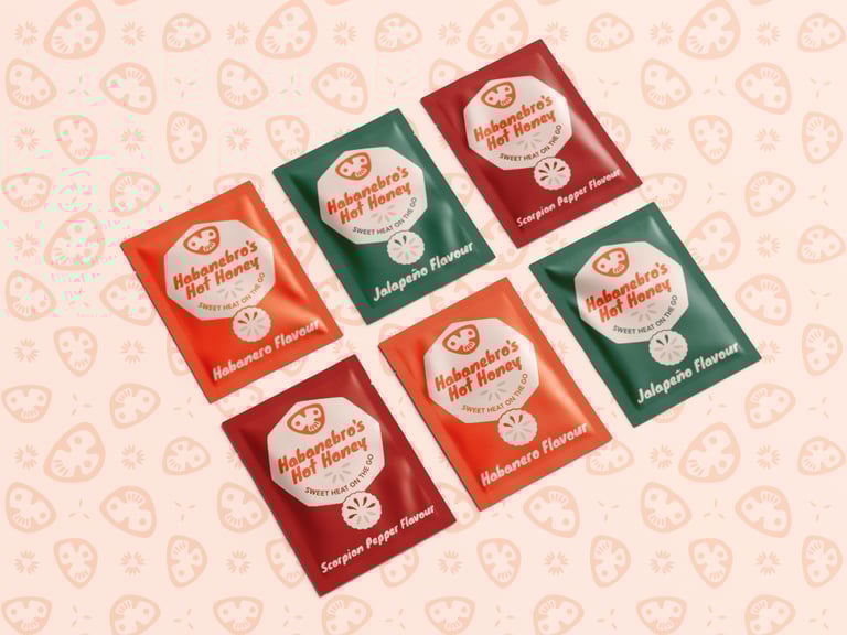
The brandmark offered Habanebro's the biggest chance to visually differentiate. Most competitors settled for just a wordmark, or had some variation of a bee or hive as their brandmark. We asked Habanebro's for 5 things they associate with their brand, they replied: chillies, honey, skulls, flames, and bees.
We began by sketching ideas, combining these different objects to create an idea that was unique. We settled on an idea which combined a sliced chilli pepper, with a rough skull shape. The resulting mark became a clever visual, by turning a sliced chilli into a brand mascot. The mascot has a smiley, slightly cheeky expression, creating a mark that no competitor came close to.
Flexibility.
We designed the mascot to be flexible. Minor adjustments like swapping out the eyes for flames, or crosses, allows it to be an expression of how hot the product was. Adjusting a brandmark often comes with the risk of losing brand equity, but in this case it has added to the character and made the mark more memorable.
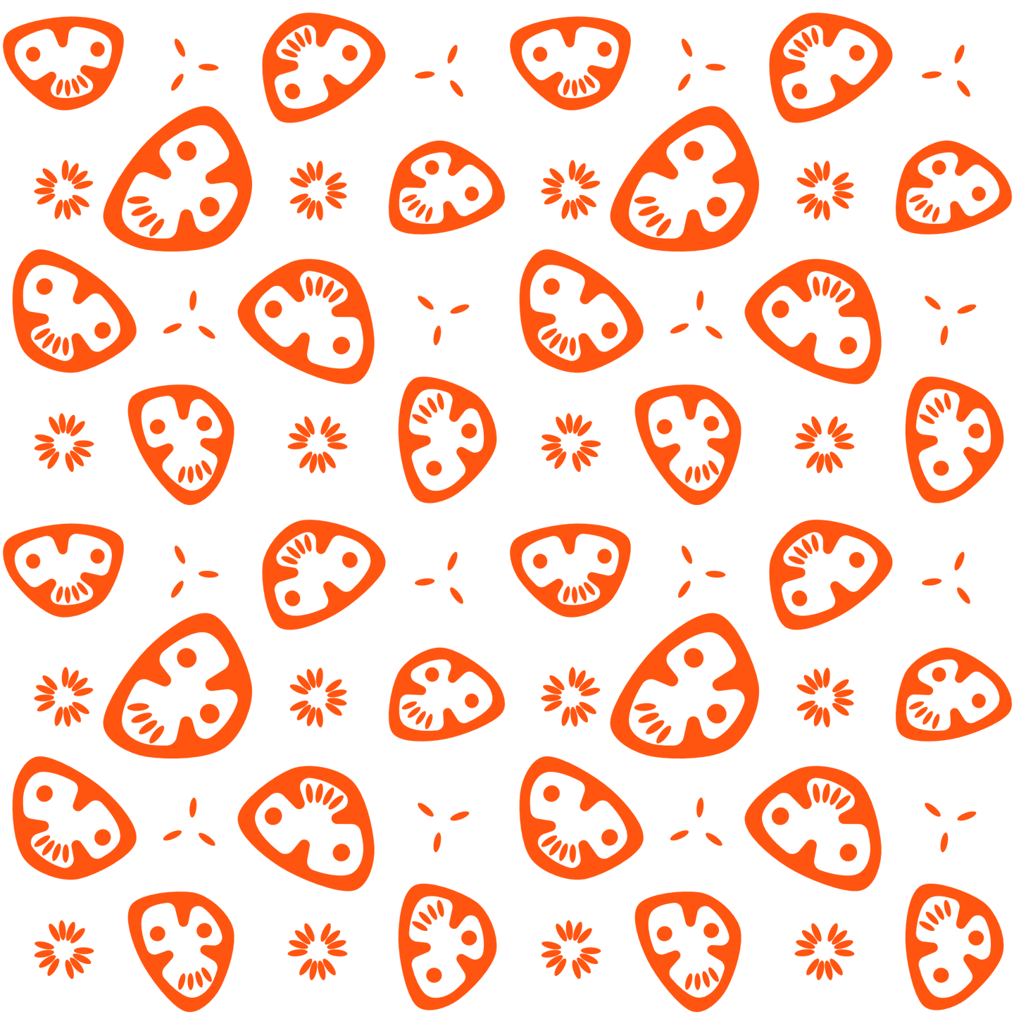


The simplicity of the brandmark allowed it to be flexible. By rotating the chilli shape and moving the eyes and chilli seeds, new faces can be made. Each of these faces, despite the use of the same elements, has it's own expression and individual character The gaps between faces is filled with patterns consisting of chilli seeds, mirroring the mouth of the mascot.
Spice-o-meter.
The 'spice-o-meter' is a graphic that quickly communicates a level of heat for a product. The graphic is made of two elements, chilli seeds, and chilli peppers. By toggling on more peppers you can symbolise more heat.
The graphic has designed to be flexible, it can convey 8 different levels of heat, and can be recoloured to match packaging. It has also been designed to be adaptable to become a loading spinner for a website, cycling between seed and pepper.


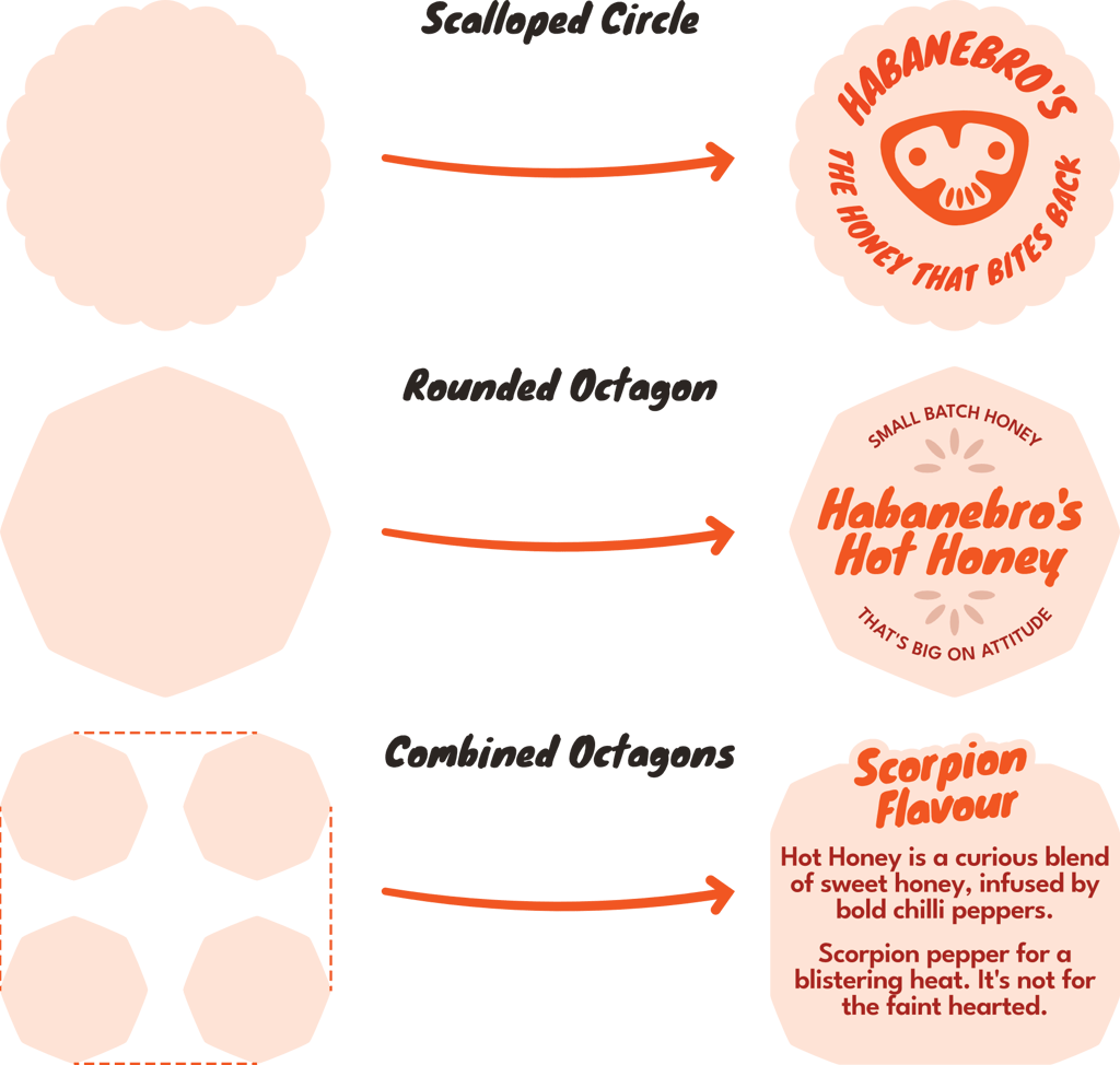
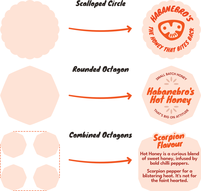
Brand shapes.
The brand uses a variety of shapes that are just a touch away from 'normal'. These shapes have a slight character that allows them to standout without looking abnormal.
The Scalloped Circle is rounded, with slight scallops which give the appearance of a badge or rosette.
The Rounded Octagon features rounded points, but also the edges bent outwards. This softens the shape by reducing its harshness.
The Rounded Octogons can be combined by adding a stroke between them. This creates a new 12 sided shape with similar characteristics, but introduces a large section for text. This makes it suitable for highlighting text, or an ideal container when used on packaging or busy backgrounds.


Let's discuss a project.
VoidD Creative © 2025