

Copper Council
Copper Council was founded by three friends who grew up in Coniston, UK. The three shared a passion for gin and set out to distill small batches in their hometown.
The three would take a vote on what ingredients and quantities to use, and through this voting they would call themselves the council. Combined with the copper still they used to distill their spirit, the brand Copper Council was formed.
The problem.
Copper Council were starting with a fresh slate, they had no existing identity, and no direction on how to visually position themselves. What Copper Council has however, is a great story behind their name. They were intent on targeting the craft gin market with a product that felt premium, rather than vibrant or quirky.
The solution.
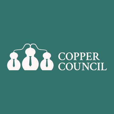
The thought process behind the Copper Council logo started by selecting elements of the brands story. Three vital pieces of information were "three friends", they called themselves the "council" and that a "copper still" was used to distill their spirit. Brainstorming ideas around the word council led to ideas such as formal attire, integrity and unity.
I used the general outline of a copper still and shaped it to look humanoid. To fit with the formal attire I adorned the shape with the negative of a tie. To fit in with the three friends and unity, I created extra copies of the shape and linked them together with the shape of the condenser coils used in the distillation process.
The final logo mark looks like a group of people while also having enough detail to be viewed as copper stills.

The detail.
The Colour Palette.
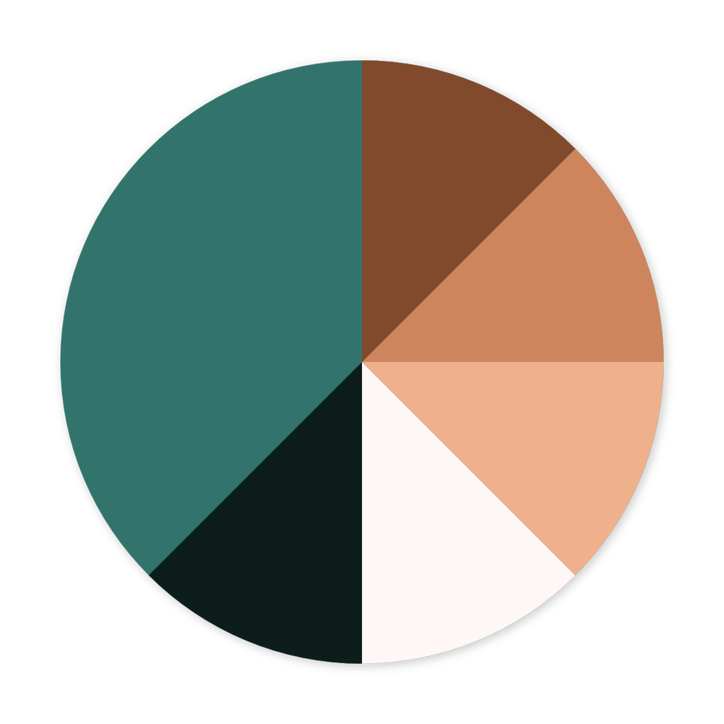
The colour palette for Copper Council was inspired by the oxidisation process of copper metal. The main primary colour is a rich green hue which I named oxide. You see this colour across many important buildings such as council buildings that commonly used copper metal in their roofs.
The other colours are three varying shades of copper where the orange hue provides a contrast to the primary oxide. To complement these, warm white which has warmth from the copper and oxide black which has blue/green tones from the primary colour.
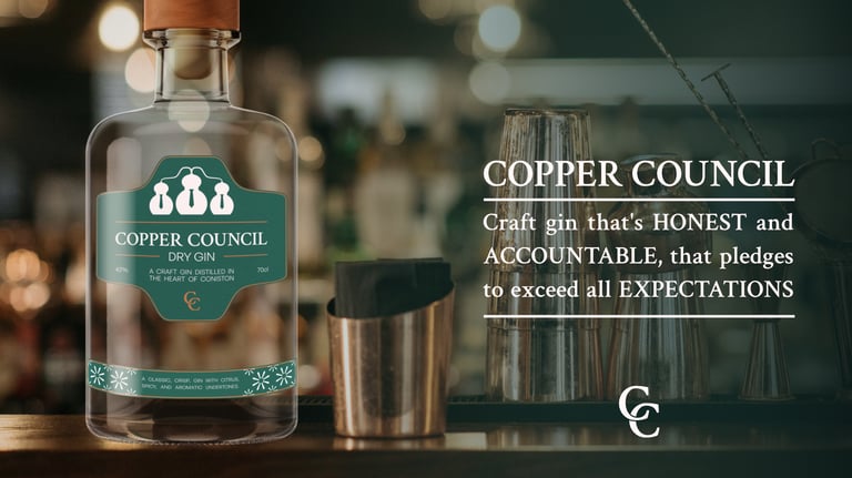
The imagery.
The image direction also follows the theme of copper, with the use of copper barware and warm and green tones to create a warm atmosphere. The below image comes with the thoughts of a speakeasy bar, a cosy setting, while feeling formal and premium.
The messaging has Copper Council's values embedded, with accountability being one of their key values, while using words like pledge that fit the brand's formal theme. The messaging is intended to elevate the viewers perception of the brand.

Let's discuss a project.
VoidD Creative © 2025